Explore Autism iOS Mobile App
Guiding parents through the Autism diagnostic process
Timeframe: June - December 2021
My Role: UX Designer throughout this capstone project from user research, user flows, sketching, wireframing, visual design, prototyping, and testing
Overview
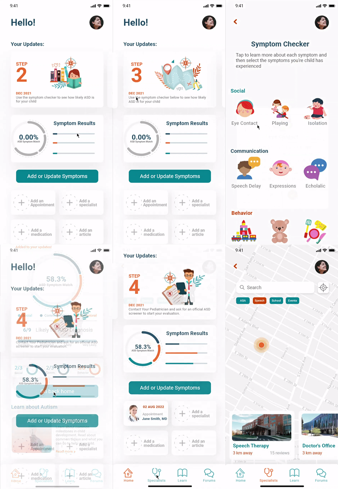
Explore Autism is a iOS mobile app which guides parents through topics surrounding an Autism diagnosis by suggesting concise steps with detailed learning information along the way. The goal of the project is to take the complex diagnostic process and break it down to relevant and customizable steps that families can follow.
Problem
Autism prevalence is steadily increasing and education about neurodivergence remains stagnant. Current available information is widespread across many sources and can be overwhelming to digest. Emotional toll is high as many parents experience a range of emotions.
Design Processs
I used the 5-stage Design Thinking model to find a solution.
Empathize
Define
Ideate
Prototype
Test
“Autism rates have increased by 10% to 1 in 54 children being diagnosed with ASD by age 8”
- CDC, www.cdc.gov
EMPATHIZE & DEFINE
Research
User Interviews
My primary research methodology included five 30-minute user interviews with the goal of finding ways to make the diagnostic process easier to follow. To do this I screened participants who have gone through the process to pull insights on their pain points.
Research questions:
How do people learn what to expect during the evaluation process?
Where do people turn to find emotional support?
What part of the evaluation process caused the most stress?
How do people keep track of various points of contact?
Participant criteria:
Parents who have an autistic child of any age
Parents use mobile apps and internet frequently
Parents who have no previous experience with other diagnostic processes
Received diagnosis within the last 1-3 years
Research Synthesis
After conducting interviews I used affinity mapping and empathy mapping to organize my research.
First, I used affinity mapping to categorize major themes that were regularly brought up by participants. The major themes were:
Feelings of isolation
Need for self care
Research sources
Common challenges
Finding specialists
Parenting advice
Teen/adult needs
Next, I created an empathy map to understand how the user might behave by looking at what they may be feeling, thinking, saying, and doing.
After listing out the pains and gains I created a user persona that is a realistic representation of the target audience based on qualitative research.
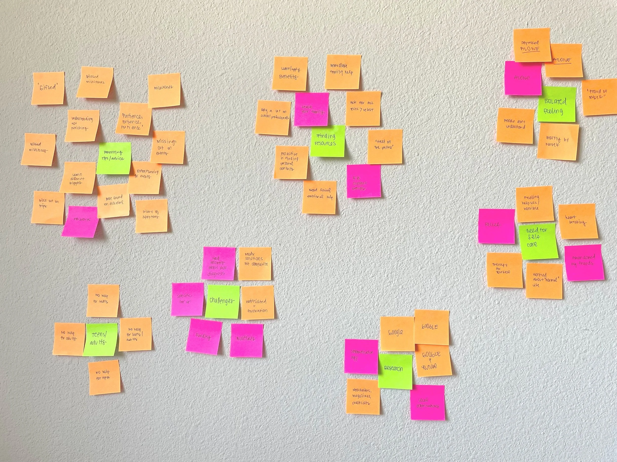
Affinity Map
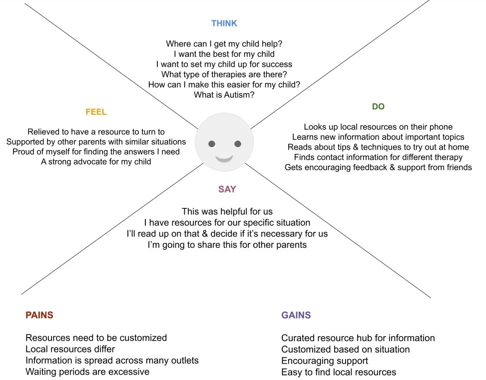
Empathy Map
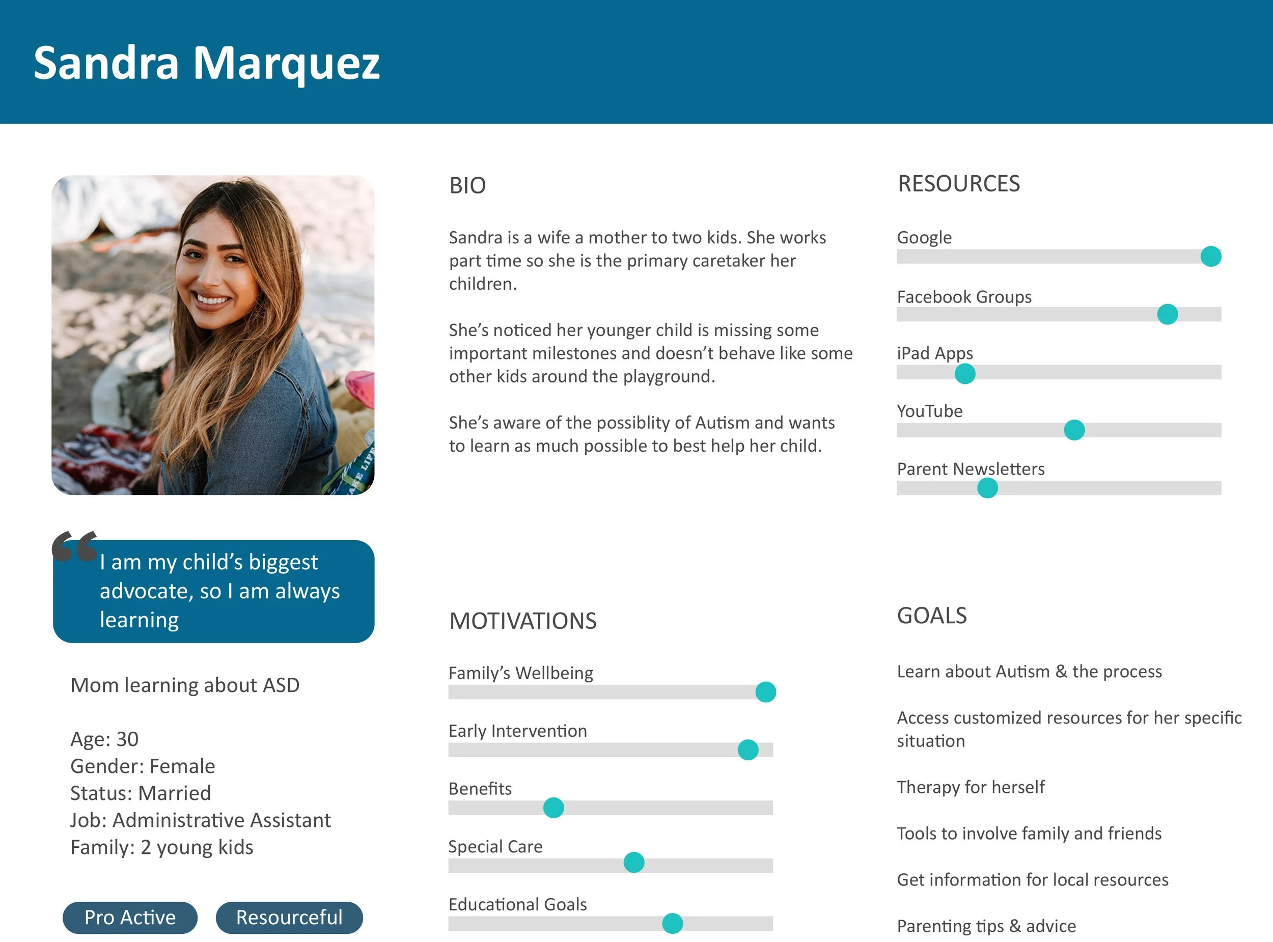
User Persona
Defining the Problem
Once I organized the research I was able to pull four main insights:
Customization: Users have unique situations and need to be able to have customized information available
Information: Reliable information is paramount at all stages and this can be in the form of articles, peer tips/advice, and quantitative data.
Local resources: Having a directory of local contacts is important, this can be in the from of doctors and therapists, but also events and school information
Self-care: Parents reported the importance of participating in therapy for themselves as they seek help for their children
“How might we” statements were developed based on the four insights to start the ideation process.
How might we provide parents with therapy for themselves while presenting solutions for their child? (Self-care)
How might we curate & customize resources for specific Autism needs? (Customization)
How might we teach about early intervention during the waiting period? (Information)
How might we offer information about benefits and local therapy contacts? (Local resources)
IDEATE
Early Sketches
Early ideations were based on the four insights pulled from the research and the user stories formed from the perspective of the user persona, Sandra.
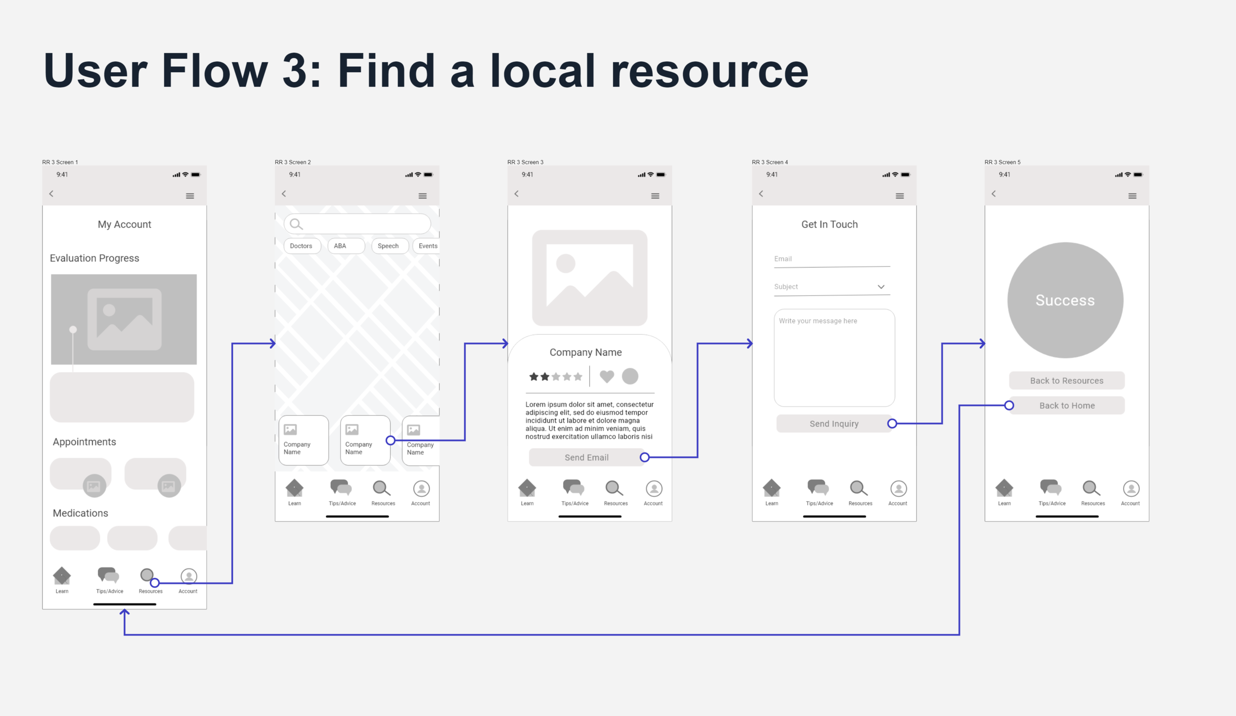
I began by sketching out the basic features of the user journey.
The user should be able to create an account to add customization features
The user should be able to enter symptoms to start their research
The user should be able to find a local specialist
Testing
The main goal in testing the initial sketches is finding the best way to input symptoms. I tested two methods of inputting symptoms. The majority of participants preferred version B.
Having a diagram with topics, once the topic was selected, 1-3 symptoms would show up towards the bottom of the screen where the user can select the intensity of that symptom
The symptoms are laid out and the user simply selects which symptoms apply to their child.
Wireframes & Wireflows
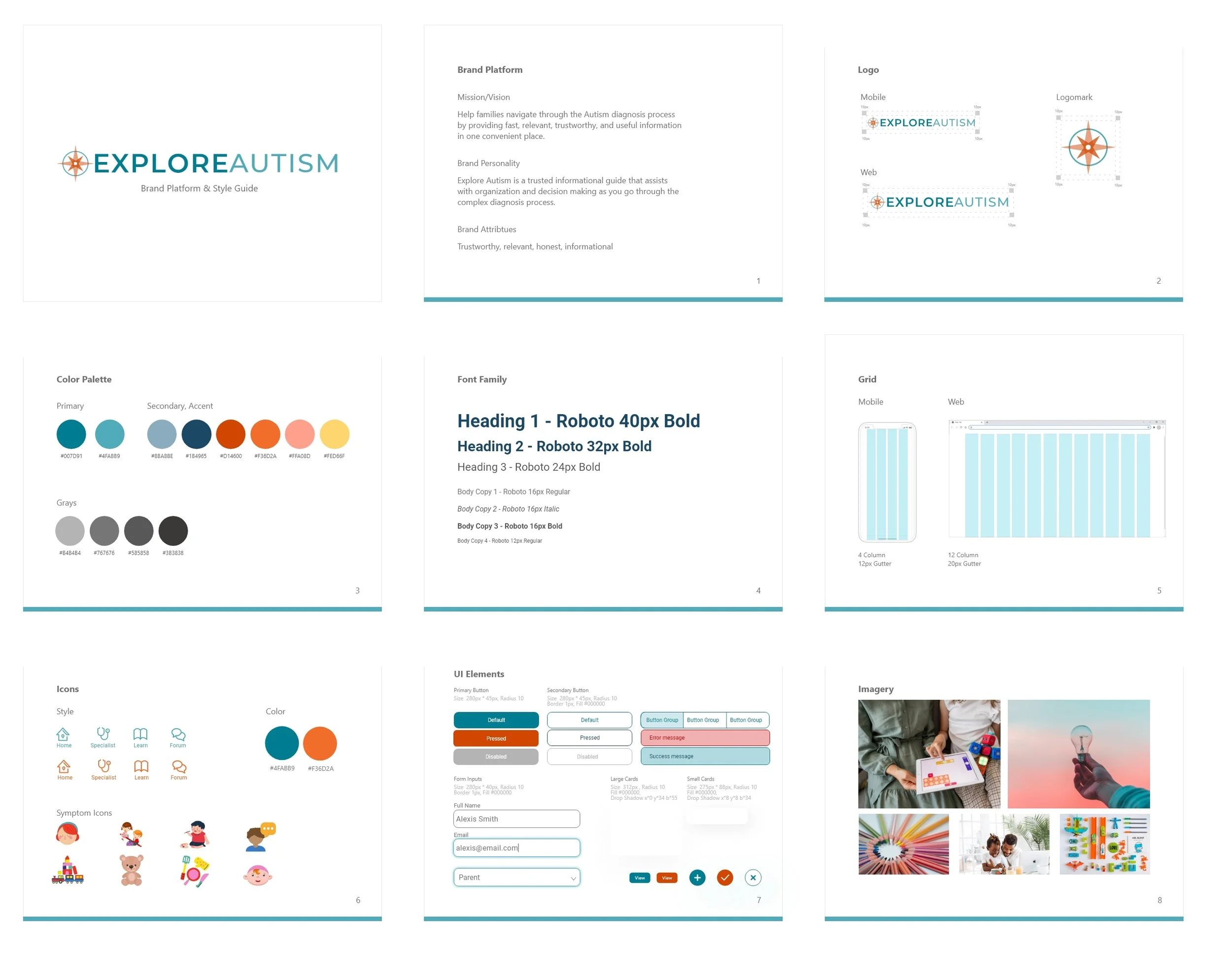
User Interface Design
I focused the design system on the brand attributes: trustworthy, relevant, honest, informational.
PROTOTYPE & TEST
Prototype
Usability Testing
I conducted two rounds of usability testing using the high fidelity prototype.
First Round:
-Major issues found with main progress bar
-Graphics not descriptive
-Button and category labels are not descriptive
I decided to take a step back and create a journey map to better understand why the user was having a hard time understanding the “Diagnostic Progress” section. I realized that as a first time user their interactions with the app will be different than a returning or longtime user who has already gone through various other touchpoints.
Second Round:
After iterating on the design users displayed less hesitation and completed tasks quicker. The updated Diagnostic progress section was not ignored and users interacted with it much more than the first round.
CONCLUSION
What I learned
Overall, the users were successfully able to get through the red routes. However, because of the complex nature of the problem the minimum viable product resulted in a good starting point. There are many touchpoints in the evaluation process involving doctors, school personnel, specialists, insurance companies, and family/friends. I learned that the way users interact with the solution will be varied depending on the information from those touchpoints. Therefore much more testing will need to be involved for returning users opposed to first time users shown through these tests.


